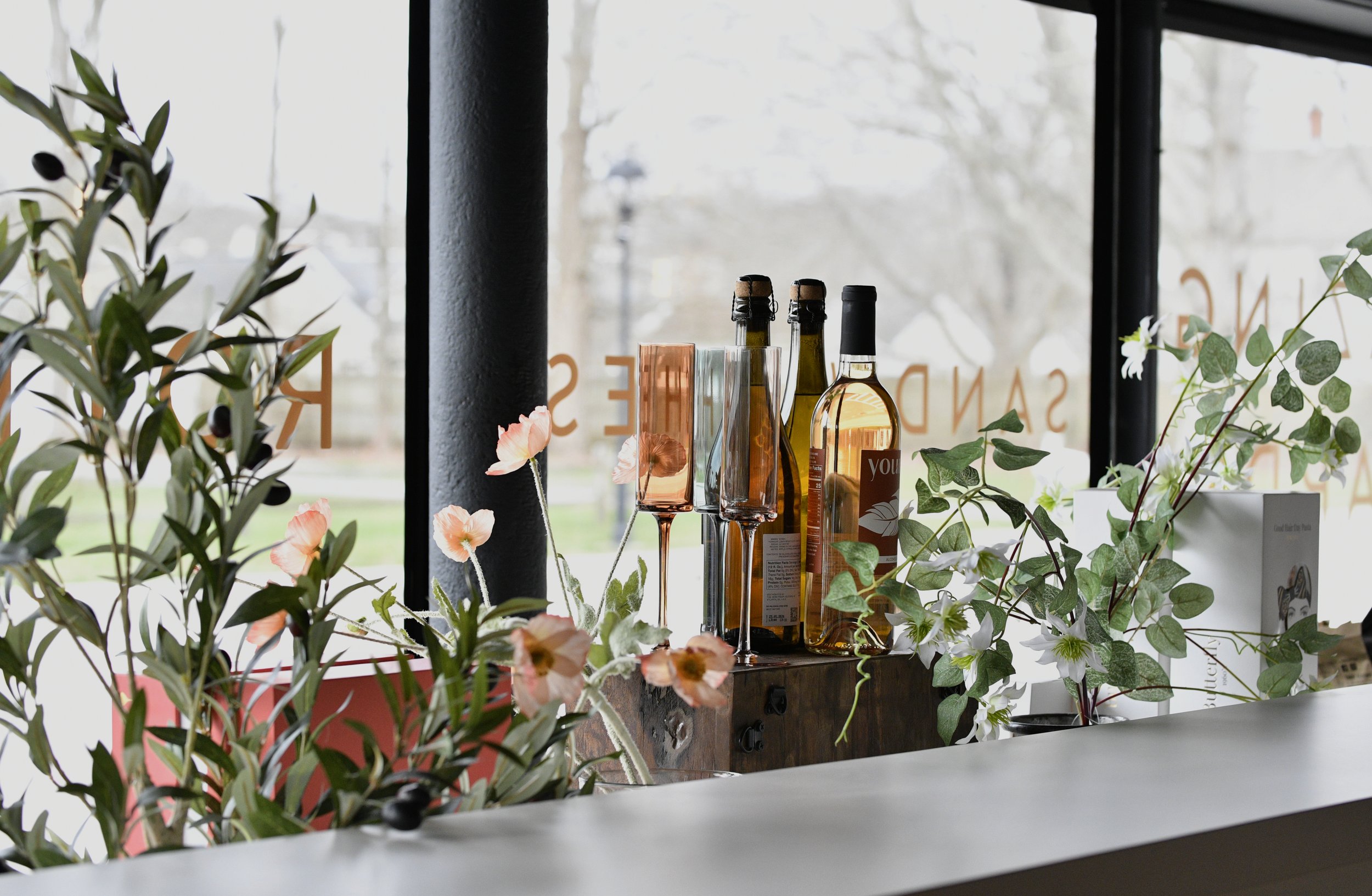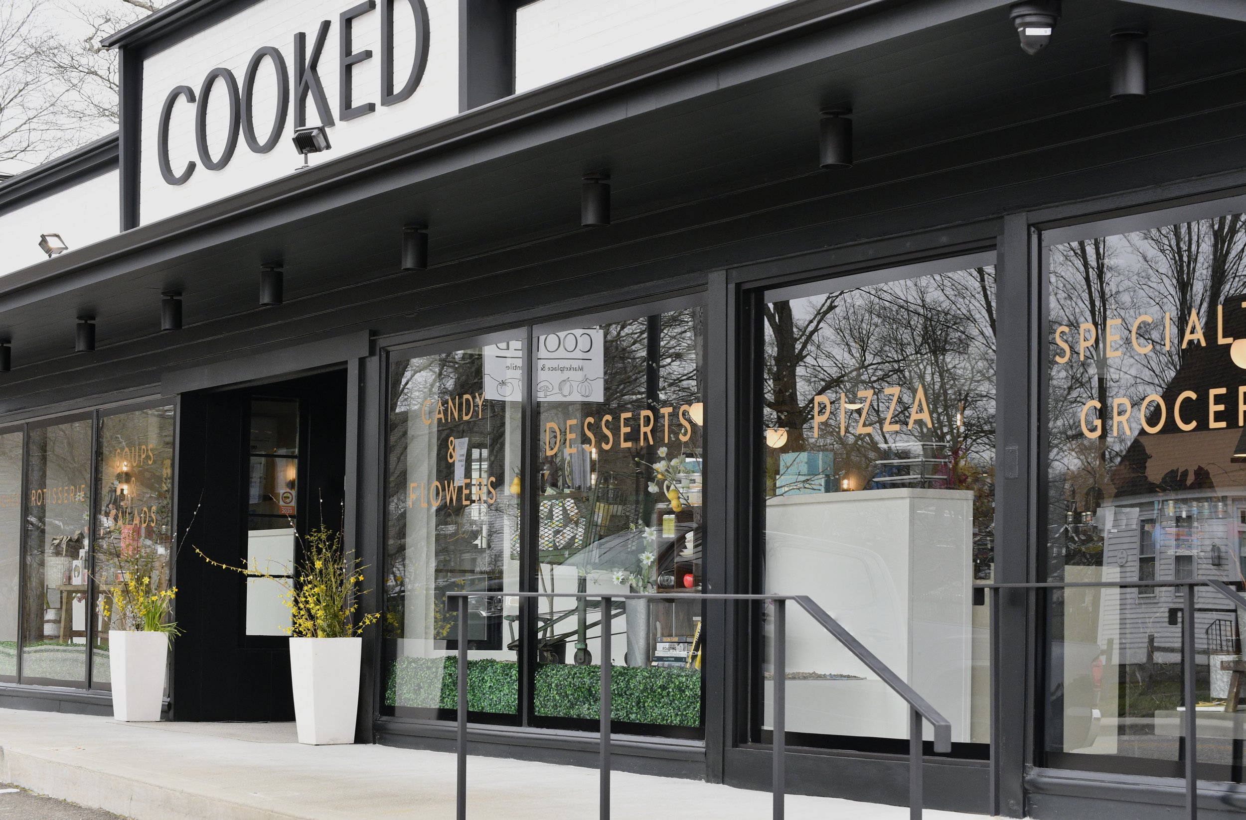

A Local Prepared Foods Hub
COOKED is a new fresh, frozen, and dry goods marketplace on the Connecticut River inspired by local farmers, international flavors,
and world-class food halls.


With a focus on fresh ingredients, the refrigerators and freezers are stocked with pre-made dishes large enough for hosting, meals for a family, and a wide variety of individual pre-cooked ingredients for you to piece together your own meal.

The logo needed to reflect COOKED’s core qualities: a refined, craft, destination spot.
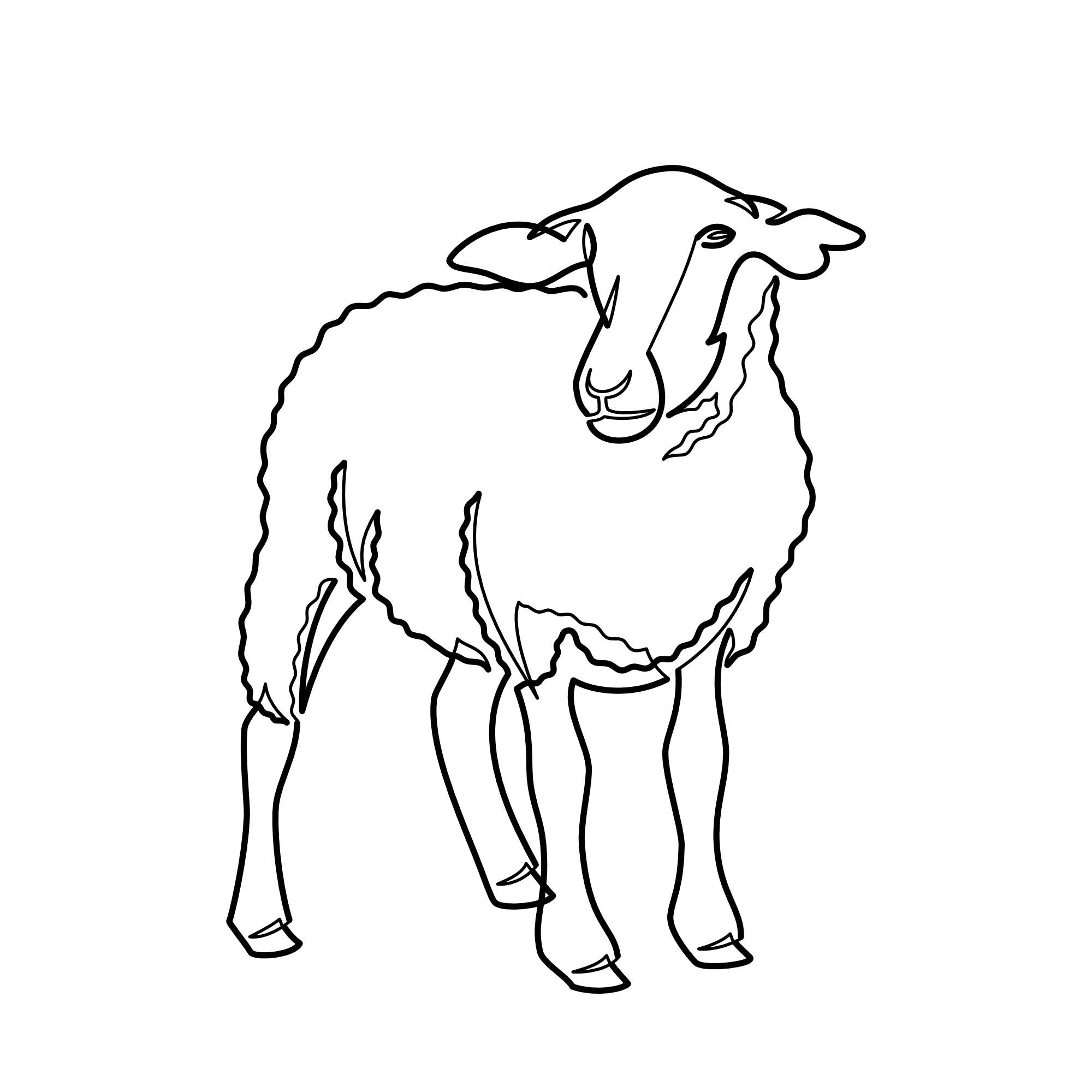
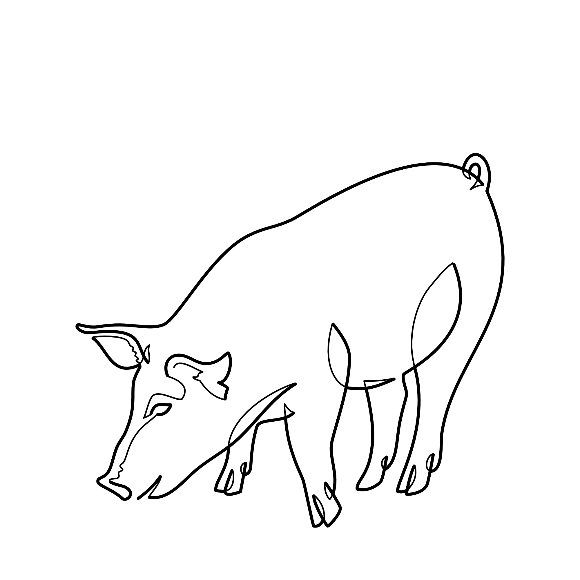
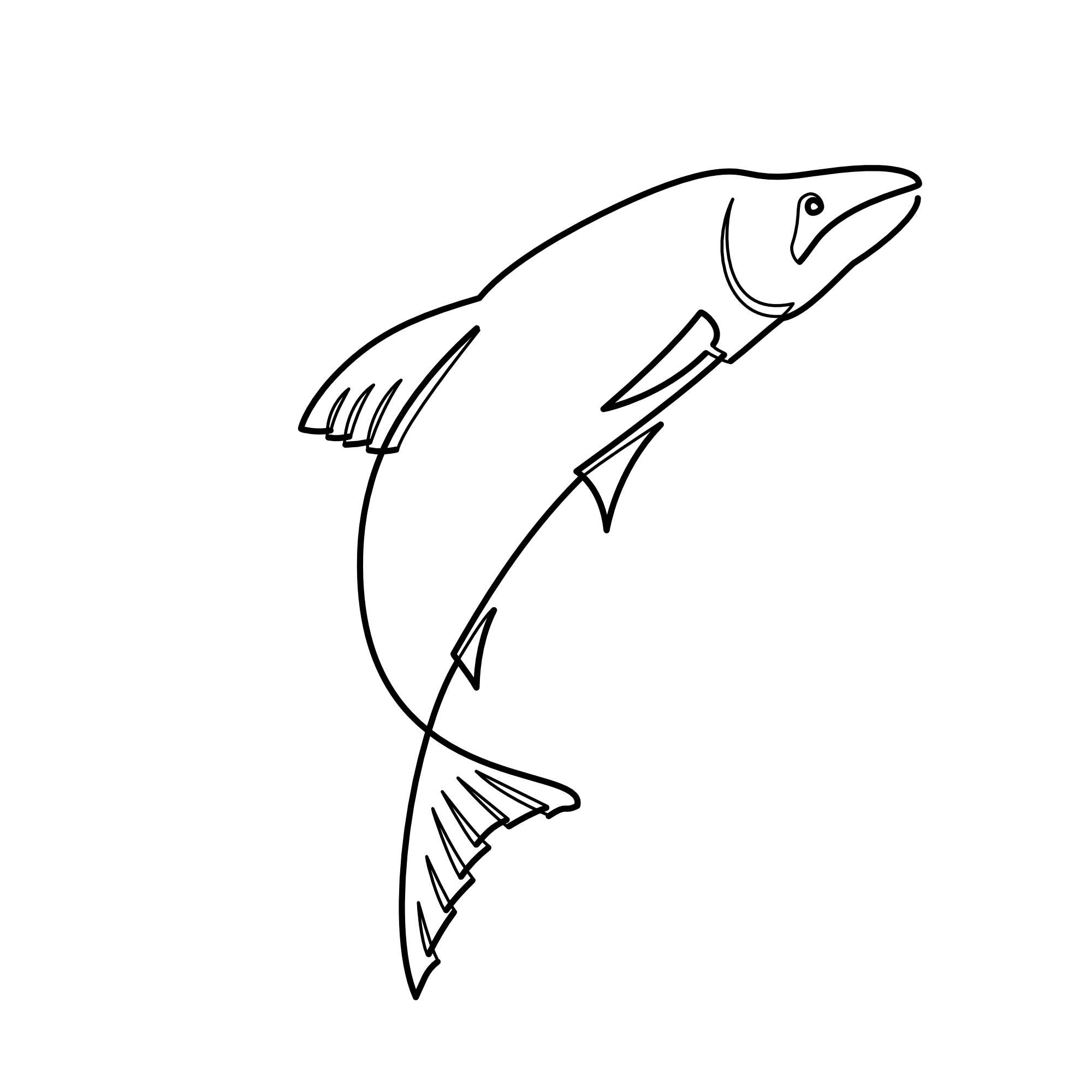
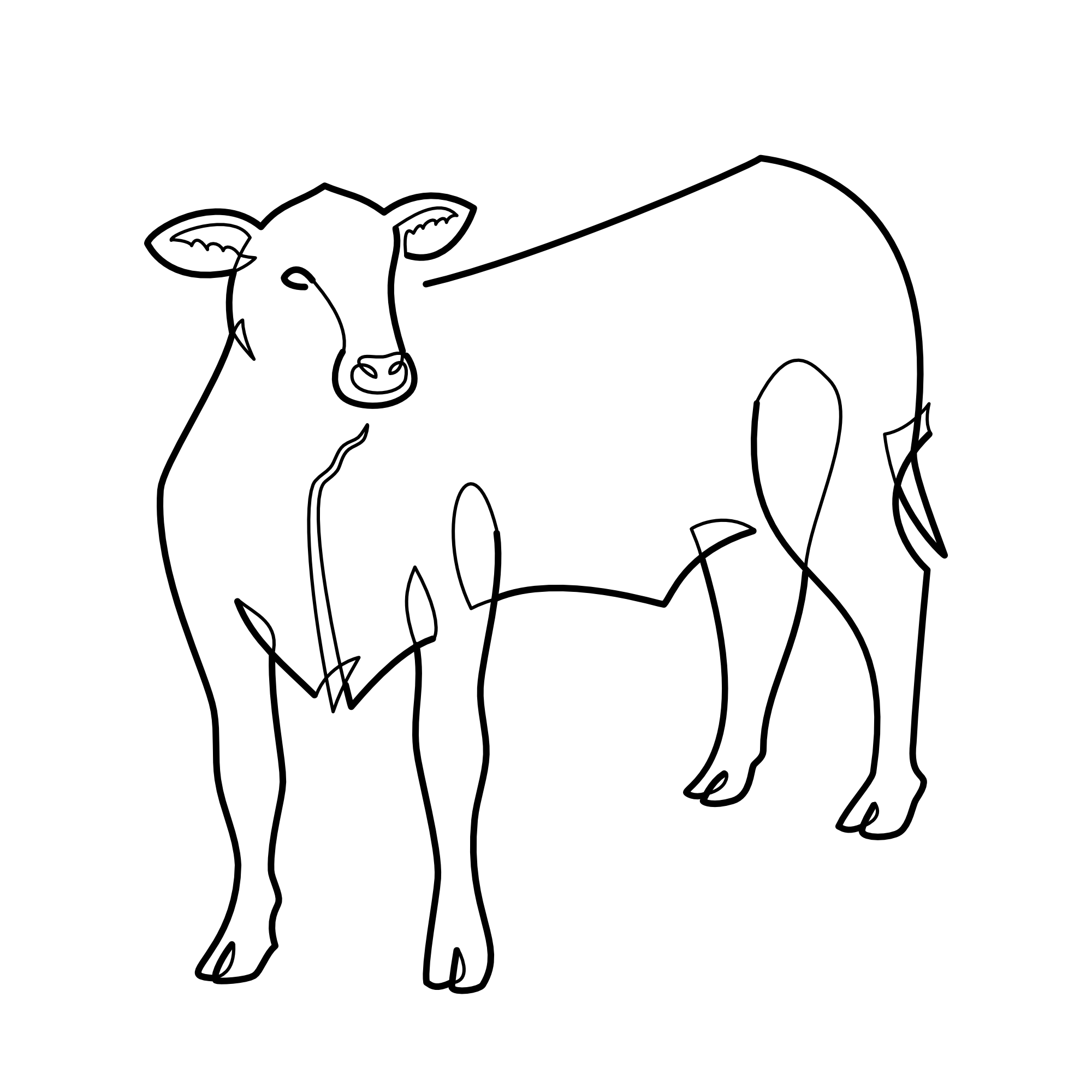
There was an early interest in having a line of vegetables below the company name but it needed to keep a healthy distance from anything too “country market,” and so the concept of the minimalist illustration came about. The vegetables speak to the fresh ingredients used and are connected by a single line, suggesting both the refined nature of COOKED’s dishes and the idea of piecing together your own meal.

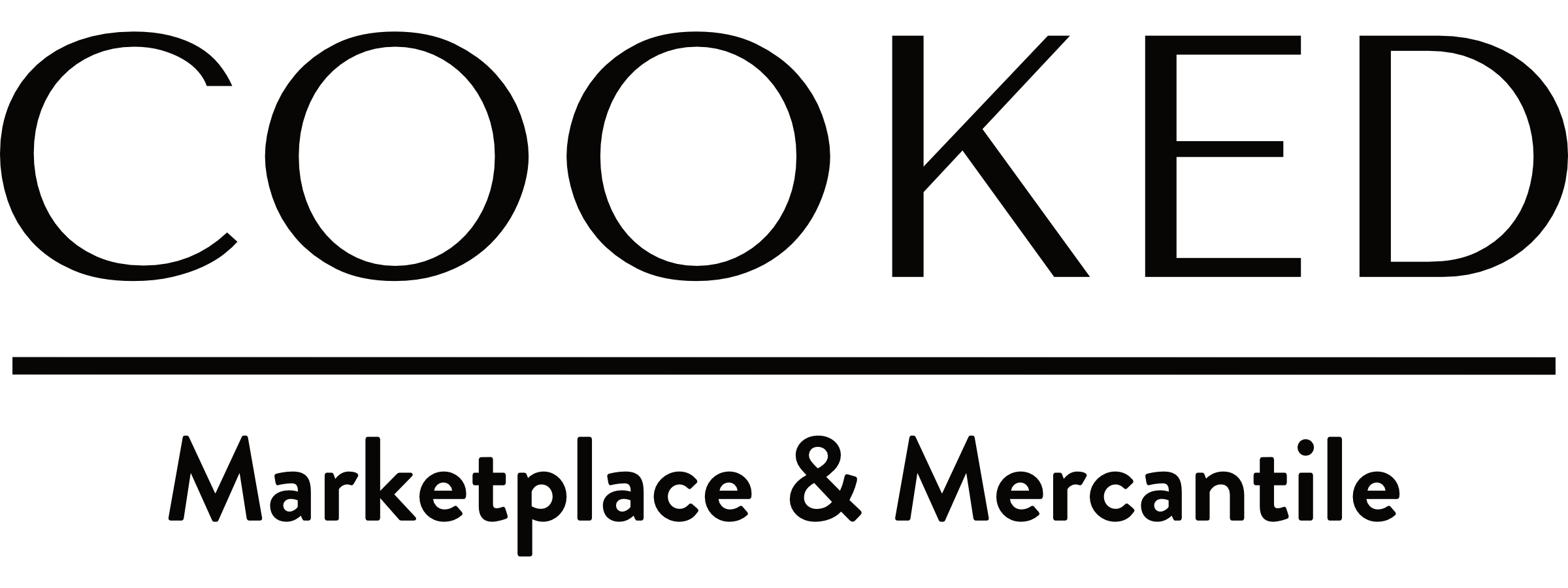
From the resolved logo grew the full brand identity. Color palette, signage, product labels, packaging sleeves, business cards, stickers and more all fell into line embracing the core ideas from the logo: a simple, refined statement that holds a place for play.


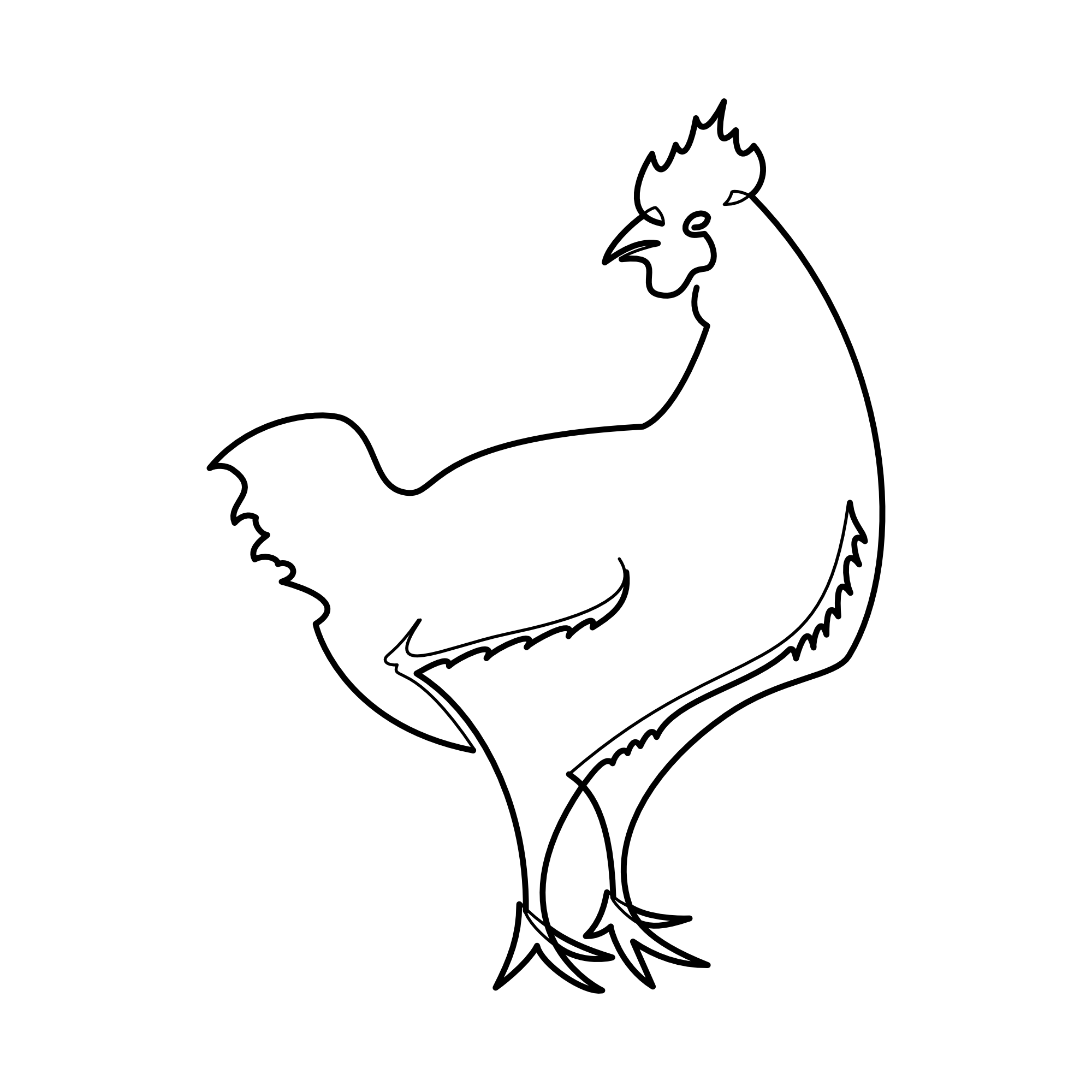
Most of the food at COOKED is prepared and ready to take home; some is made to order, like their sandwiches and salads. To identify the type of sandwich for the cashier (and whether a dish is kid-friendly) a series of illustrations were produced for 1-inch stickers.


Taking it online
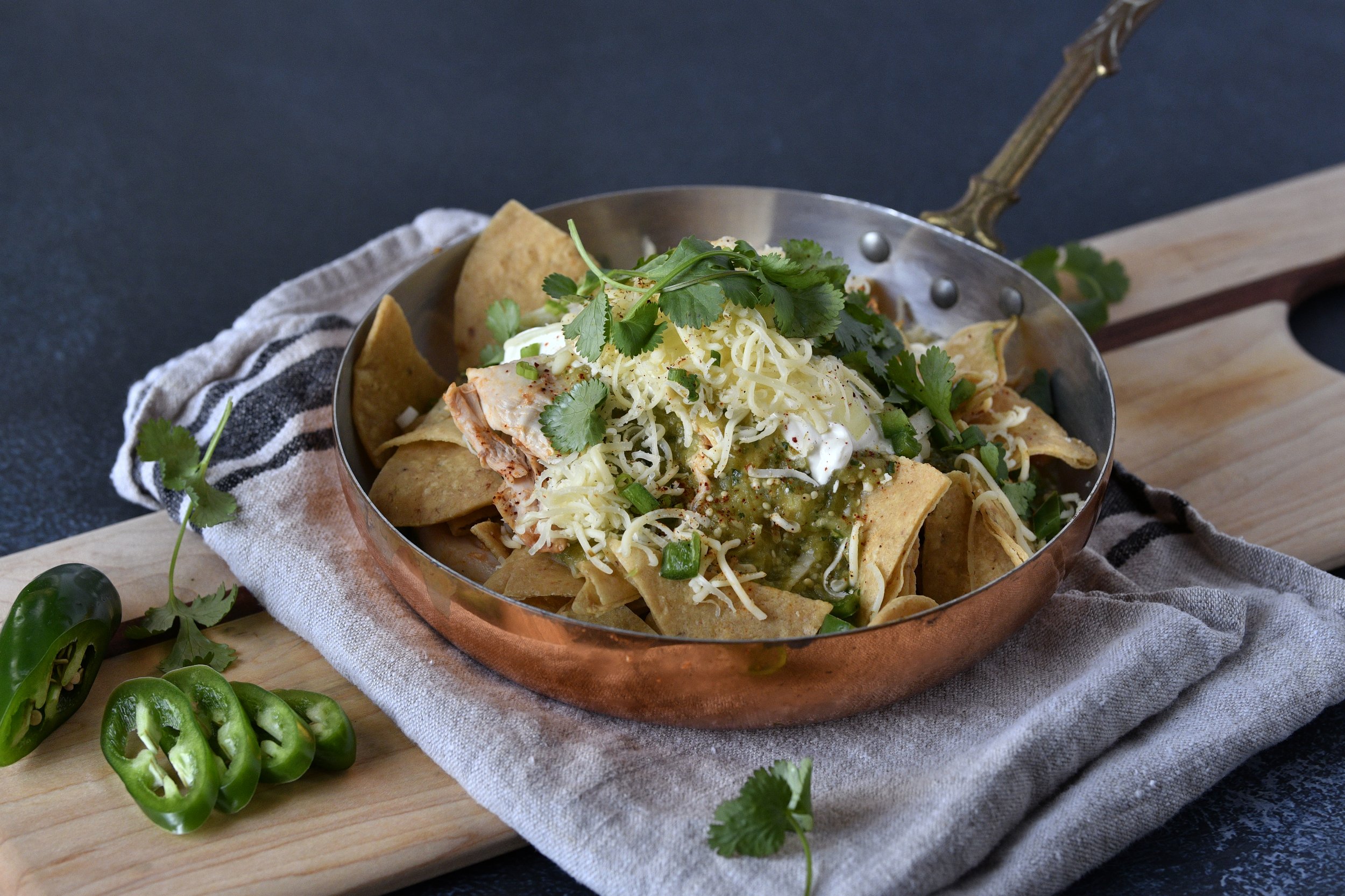
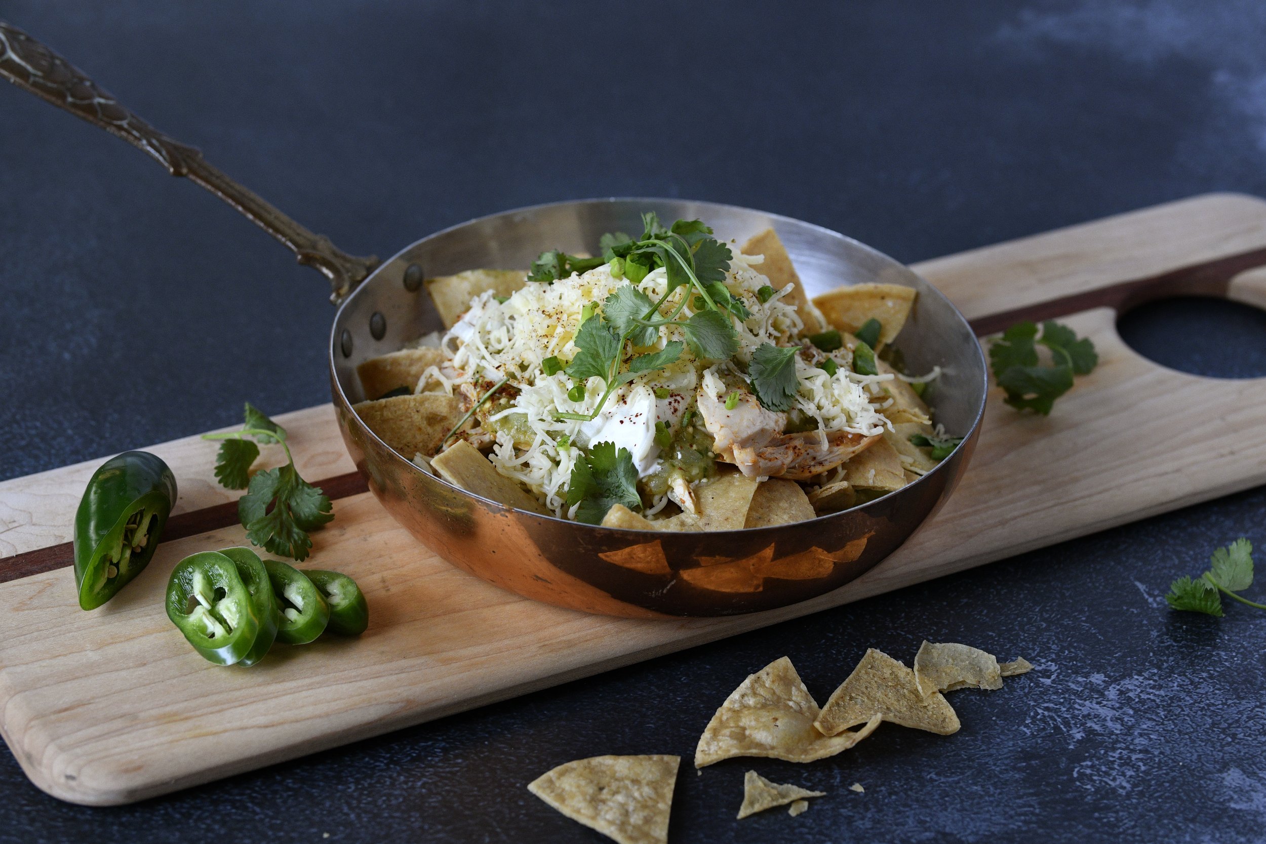
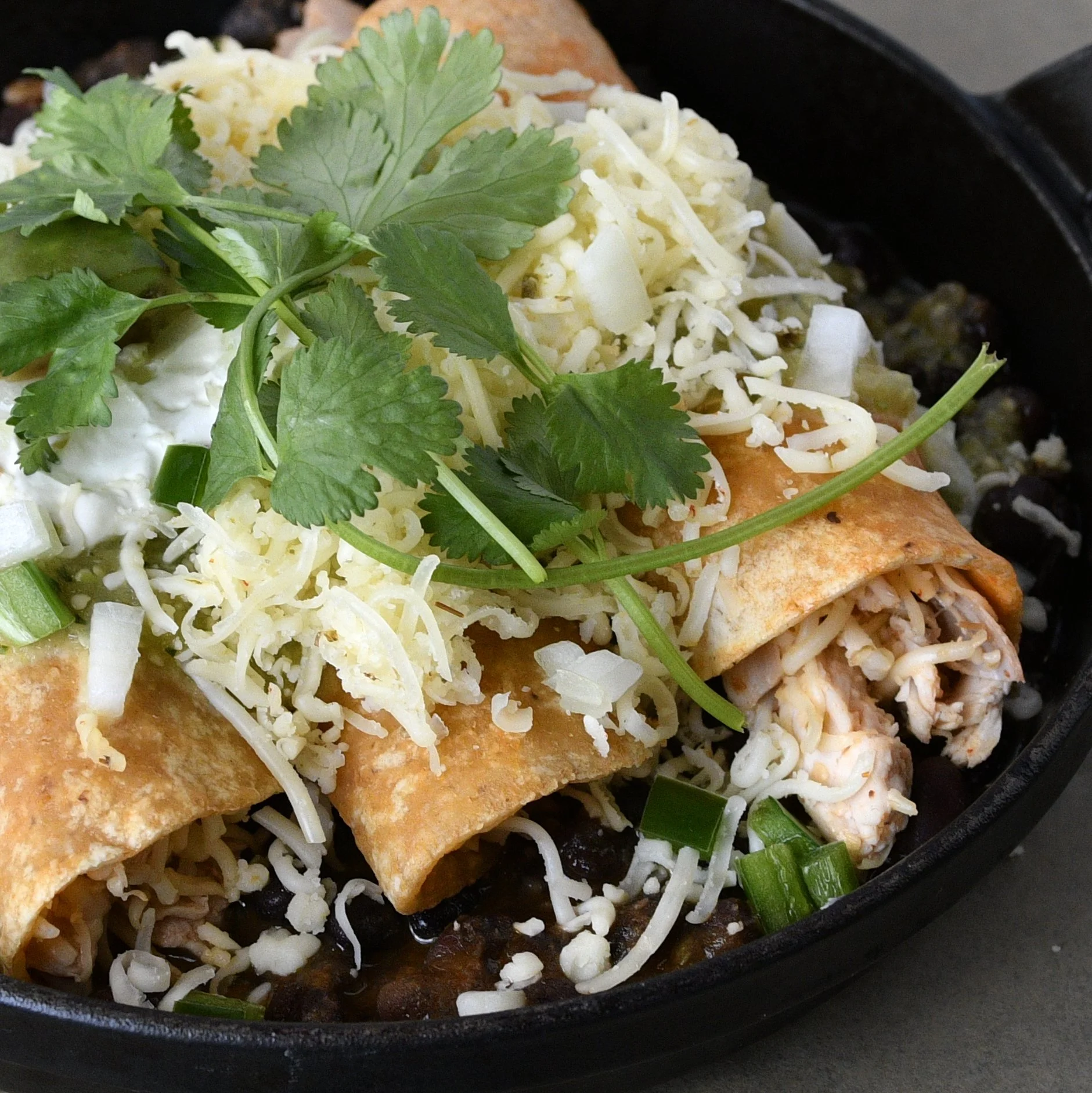
The website needed a straight-forward layout with a custom menu page to encompass their ever-growing selection of pre-made and made-to-order foods. Representation of their food was critical and called for a series of staged photos.

Home page

Home page

Mercantile page

Mercantile page
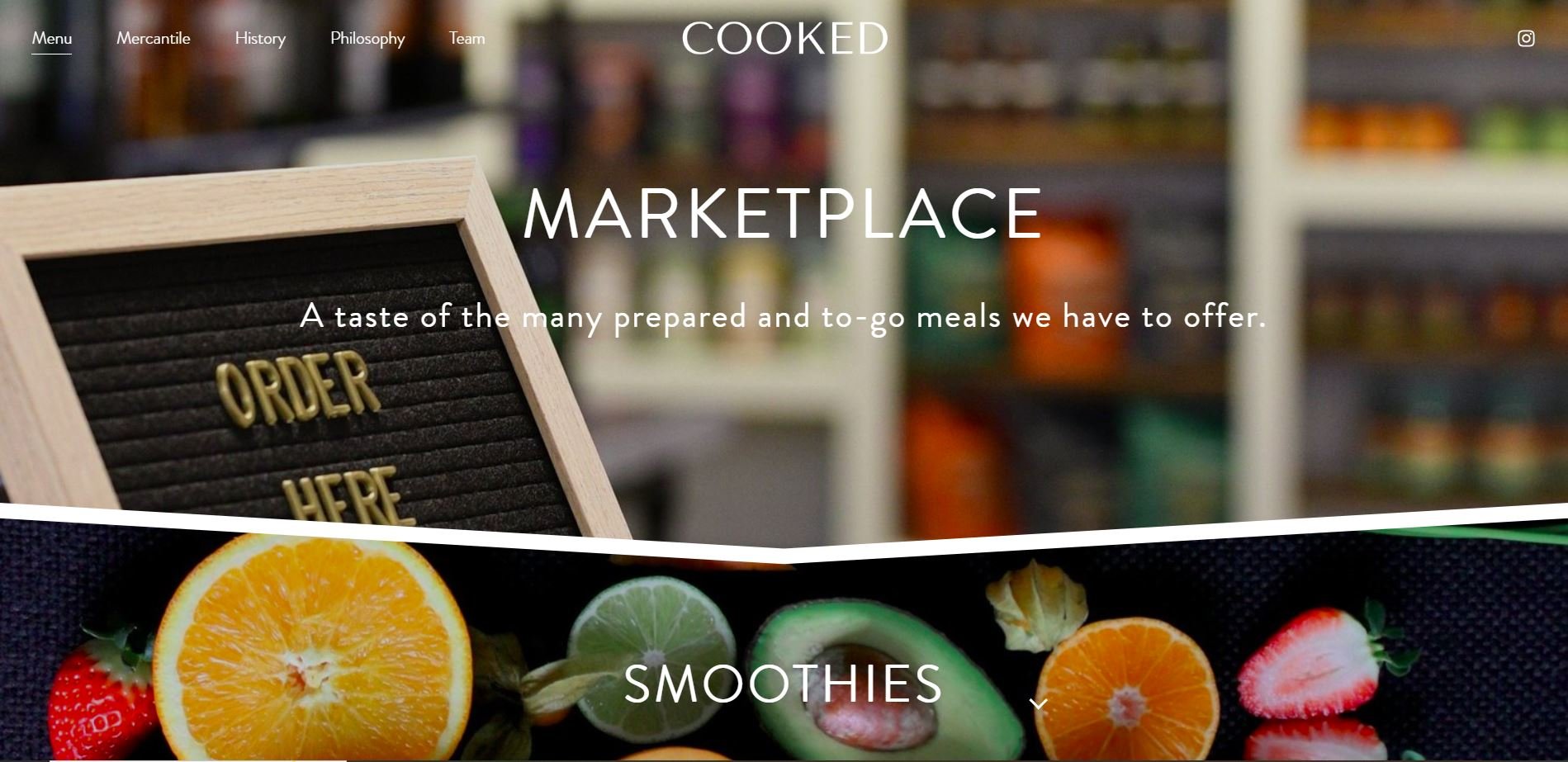
Marketplace menu page desktop
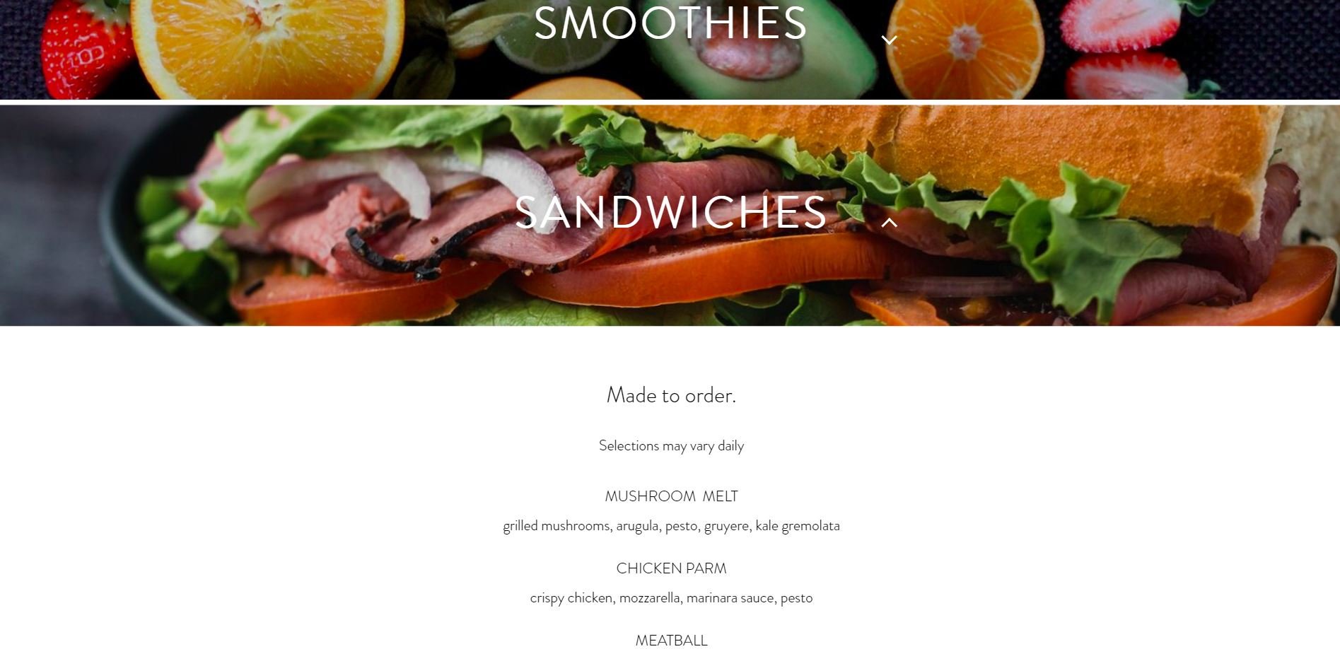
Marketplace menu page | custom dropdown
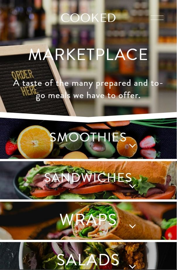
Marketplace menu page mobile
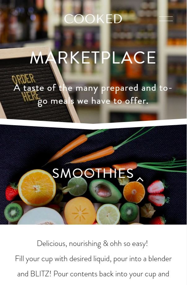
Marketplace menu page mobile
Mobile navigation menu